52 Weeks of Print: 37/52 Reduction Print

Another attempt at reduction printing this week so, again, I kept it fairly simple.
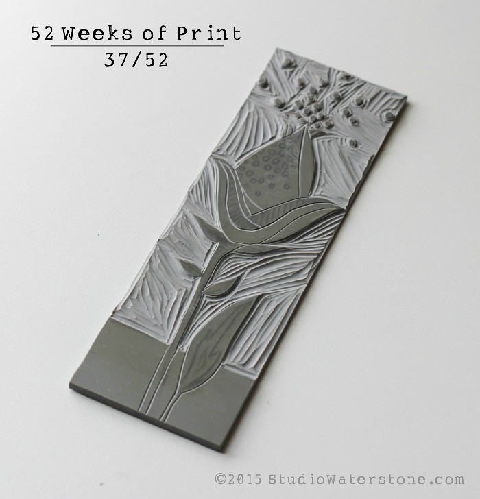
This is my initial carving.

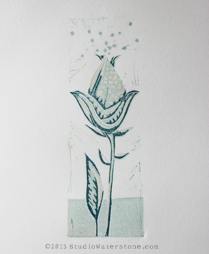
And this is the final.
Critical: I think there should have been more detail in the final layer. My first attempt had dark brown as the final, darkest layer and that was too much. So, I switched to a dark teal blue.
In my opinion, reduction printing is similar to watercolor in that you go from lightest to darkest AND that you should have a pretty good idea of the end result when you begin. This is where I tend to run into problems because it's still very new. Here's my first attempt and I find this chart very helpful when planning.
I'm still intrigued with the entire process of reduction printing and there will most certainly be more in the future.

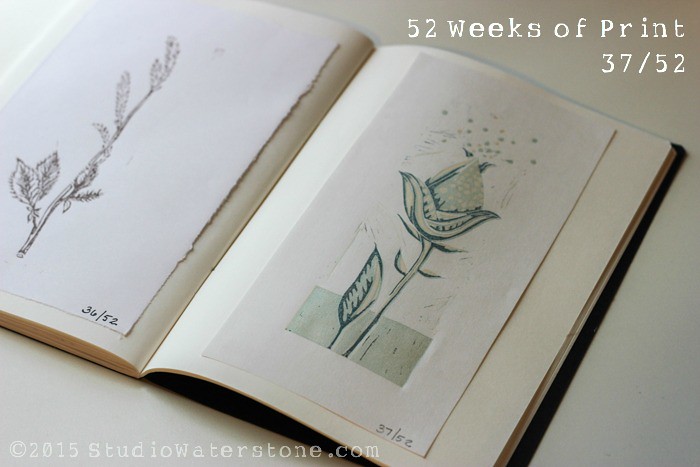
Week 37 of 52 Weeks of Print
Click here to view weeks 1-36 or here to follow along on Pinterest.
Oh my word that's gorgeous.
ReplyDeleteThanks, Lori!
DeleteI agree, it's difficult to go from lightest to darkest if you haven't already an idea of what you're end result is going to look like. This is however a stunning piece! x
ReplyDeleteLouise
http://louiseplace.com